Wednesday, March 11, 2015

Scratchboard


My scratch board goal was to achieve motion in the picture. The picture on the top left is of the picture that the scratch board was based off of and the top center and right pictures are of sketches. The picture is of a pool deck at the Triangle Aquatic Center. While I was completing the scratch board, I also became very impatient with the scratch board. The pool deck itself is messy and sloppy. At the end I was able to add splashed at the end each lane to symbolize the swimmers swimming past the pictures edge; the splashes were the most successful part of the piece. If I were to do this again, I would make the splashes the center of the piece and would have taken my time with the pool deck.

Tuesday, February 10, 2015

Surrealism: The Submerged City

For our surrealism project our goal was to reach outside of our "bubble". Trying to create a landscape where at first glance may appear normal, but when looked at more closely,  does not fit. My first four thumbnails all included a girl, where above water she is a mermaid, and under the water she is human.

In my more detailed sketch, I included coral above the water. The coral to the left resembles a tree, while the coral to the right resembles buildings. On the protruding land in front of the "building" coral, two fish are walking on their fins. The mermaid/girl is sitting on a submerged truck. Under the water she is human, while above the water she has her tail and top exposed out of the water. My original plan was to have the water, sky, land, and sand painted in water color, with color pencils highlighting and darkening areas for emphasis. The remaining parts were to be painted in acrylic paint. 

At this stage in my piece, I had completed the background in water color and had blocked in the colors for the objects. To create the texture in the "building" coral, I first painted the coral a peachy color, darkened some of the areas with a darker brown color, and followed through with blue highlights to stimulate the fuzziness of the coral.

In this stage, I had completed the girl's body, and the mermaids top. The "building" coral was completed as well. I had lightly highlighted and darkened areas with colored pencils but it didn't seem to be having the affect I wanted.

This is my final artwork. With the "tree" coral, I added red and blue highlights to have individual branches stand out. The fish were completed, and I added the rust to the submerged truck. The mermaid tail was completed, along with her vibrant red hair above the water and brown beneath the water. But I was still not happy with the water color background. It did not show as much depth as I had anticipated so I decided to paint over the water color with acrylic. The acrylic paint was able to show the depth I was looking for and add the extra emphasis of color I was looking for. At this stage I was finally complete with my art work: The Submerged City.


Friday, December 20, 2013

3D Fish Tank


I made a fish scene out of putty and then painted them with acrylic paint. My older brother is a marine biologist so all of these fish probably maybe live in the same ecosystem based off of his half attention approval.

3D Project

For my 3D project, I made a me. Not a mini me, a full body me. We did this by wrapping the selected body part of me in sticky side up tape and then wrapping it it sticky side down. Then we simply cut me out, stuffed the body parts with newspaper and taped the appropriate body parts together. The questionable part being is it human?

Sounds simple right?

We were doing good, all of the body parts separately looked okay for the most part. Well excluding the left leg, that was just a mess. 

But when the time came to put all of the body pieces together, it did not look normal. In theory, the tape body should have been my exact height. However the tape we used apparently was not strong enough to hold up the weight and the legs collapsed in on itself. The body ended up a head shorter than me. The project ended up being a failure so we painted the tape weird colors just for fun.

Monday, December 2, 2013

Goldfish Swimmer

My portrait was of a random swimmer. I knew that I wanted to do a swimmer so when I searched for pictures I just chose the picture that resembled a swimmer the most after we have photoshopped it. 

I thought of the idea to use goldfish one night after my swim practice while I was eating goldfish. I thought the relation between the goldfish and swimming was funny as well. 

I was challenged with the fact that not all of the goldfish were the color I needed. I ended up spray painting the goldfish to get them the color I needed. I was also faced with the fact that I had to be very patient when hot gluing all of the goldfish down....I'm not very patient....I burned myself....a lot... 

When I had finished the body of the swimmer I was faced with the decision of doing all of the water surrounding it or simply leaving it. In the end I decided to do all of the water. Even though it took three more days I was happy with my decision to finish it. I felt like it really completed the piece of art.

Tuesday, October 29, 2013

A Sticky Situation

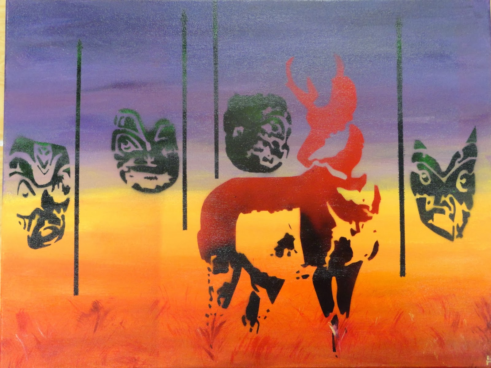
My idea for a sticky situation was to have an antelope surrounded by 4 tribal masks holding spears. The "stickyness" of the situation would come from the fact that the antelope was about to die. The theme of repetition was represented by the multiple masks. In this picture I had to project the image I had created in photoshop onto the canvas(don't judge me on what I was wearing it was inner nerd day at my school). During this first part of the project I learned a lot about photoshop.

  In this picture I was carving out the stencil. For the antelope and the masks I decided that I wanted to spray paint them while the background was acrylic paint. While I was carving out the stencils, I learned that you had to be very careful not to leave "white islands" or not leaving part of the stencil attached to the piece of paper.

When this picture was taken I had just spray painted my antelope. During this part I literally stopped breathing because I was so nervous.
 After I had finished spray painting my masks and antelopes, I decided that I needed to add spears to make it more clear of the masks intentions.
Not wanting to carve out another stencil, I "simply" covered all of the area that I did not want sprayed. This took a little bit longer than I had originally expected.....
I was very pleased with how the final piece came out. I learned a lot about how I could use different mediums together.

Wednesday, October 2, 2013

The Boy in Blue


 For this project our theme was up close and personal. When I first thought of that I thought of noses. To get my reference I googled up close pictures of noses. As we all know google never comes up with exactly what we ask for. The search came up with noses all either too close or too far away for my liking. There was one picture that was a  picture of camera taking a picture of a nose. I then changed my focus to cameras. I googled cameras and it also came up with security room screens. And thats what I decided to do. I painted a wall of blank screens on to 3 separate canvases and took 33 pictures of my little brother.

 Using the pictures I did a photo transfer onto the canvas "security screens". I glued the pictures face down and let them dry for a day. I then rubbed off the paper and the picture transferred onto the canvas. But as you would know if you have done a photo transfer before, the picture isnt a carbon copy of the original picture. Part on the picture comes off with the paper. Surprisingly I feel that this only enhanced the piece even more creating an effect that the tv screens were old and were snowing.
 I demonstrated emphasize in my art work by going over my little brothers blue shirts with a light blue water color. This emphasized that it was the same kid in every picture and made him stand out. Oddly enough I hadn't planned on making everyone of his shirts blue in the pictures. It just happened that almost every picture I had token of him he was wearing a blue shirt.
 I was very pleased with how the photo transfer turned out because it was the first time I had ever done it. With every picture I transferred I became better and better at getting all of the paper off.
 I think I did a good job with an original idea. I really liked how changed the perspective to make the pictures look like they were going around a corner.

Tuesday, September 10, 2013

What's the point?


 Some of my original ideas for the theme whats the point were people pointing, lions roaring or a person standing in the rain. I decided to choose a person standing in the rain because what is the point of just standing in the rain? I showed contrast in my piece by using charcoal. I used charcoal so I could make the black very black and the white very white. I used a white color pencil to draw the rain. Also to create contrast I made the umbrella blue. The message of this piece of art is that there isn't always a reason for something. Standing in the dark while it is pouring rain may not accomplish anything but giving you a chance to relax. I took a risk in this piece by using a spray to keep the charcoal from not smugging. While this spray did keep it from smugging it also made the paper shinny. I also took a risk by making the umbrella blue. I think by doing this it helped lighten the mood of the piece of art.

Tuesday, January 8, 2013

Photo Shop

                         I did a bird eating a fish, but the shark is about to eat the fish and the bird.

Clay Tile


Acrylic Painting

                                       My painting is of swimmers diving into the pool.


Tuesday, December 11, 2012

Monopoly Game Board

This is my two point perspective artwork. I did the game Monopoly. I think that my drawing was very successful however I think the board it to long. If I had made the board more square, I think the drawing would have been a lot more successful. I also forgot to draw the other dice, which looking back at the game board is really annoying. However I think I did a very good job at matching the colors from the picture to the watercolors. Over all I think that this artwork was a success.

Monday, November 19, 2012

3D Anamorphosis


1. In photoshop we transformed the scale to make the object longer so when you looked at it from and angle the object looked normal. This is called anamorphosis.
 
2. Based on the perspective of the angle the object could look distorted or normal. Drawing a shadow helped make the image look more 3D. We used color pencils to show the value in the anamorphosis.
 
3. To make the anamorphosis successful you had to make sure that you got the measurements correct to that it looked 3D. To do the we made a grid on the pictue and on the drawing. Then you just drew what was in the box on the picture into the box in the drawing.

Spray Paint


 1. In the computer lab we changed the picture of, for me, Aberham Linclon into positive and negative space. Basically the stuff that is purple in the spray painting is positive space and the blue, white and orange is negative space. We used photoshop and went to threshold to make the image black and white.

2. When creating a collage of book pages in the back, you wanted to add texture like a face or only writing. A girl in my class did only faces looking to something.

3. To use positive and negative space we cut out the negative space. We used a Xacto Knife to carve out the poster board making the Stencil.

4. Using the Xacto Knife we had to always make sure we had a board underneath our stencil and alway cut away from us.

5. It was important to have a strong contrast in between the colors so that you could see the image. For example dark purple against light blue, white and bright orange.

Monday, October 22, 2012

Prints (part 2)


For our print making project, I made a giraffe. I added texture to my print my carving out each individual spot on the giraffe. I was able to show depth by adding the clouds and the birds. My favorite print was the green, orange, and yellow print. I was able to use diffrent colors that made the print have a more exotic feel. Overall I feel like this project was a sucess because the print, I feel, looks really good! I made 6 total prints. One was brown on blue, blue on white, blue on yellow, brown on yellow, brown on white, and of course, orange, yellow and green on black. I really enjoyed this project because it was really fun to make the prints and see the final product!